Tip
TipThis page represents the data of an Asset or Assets as per various filters and categories in the following charts:
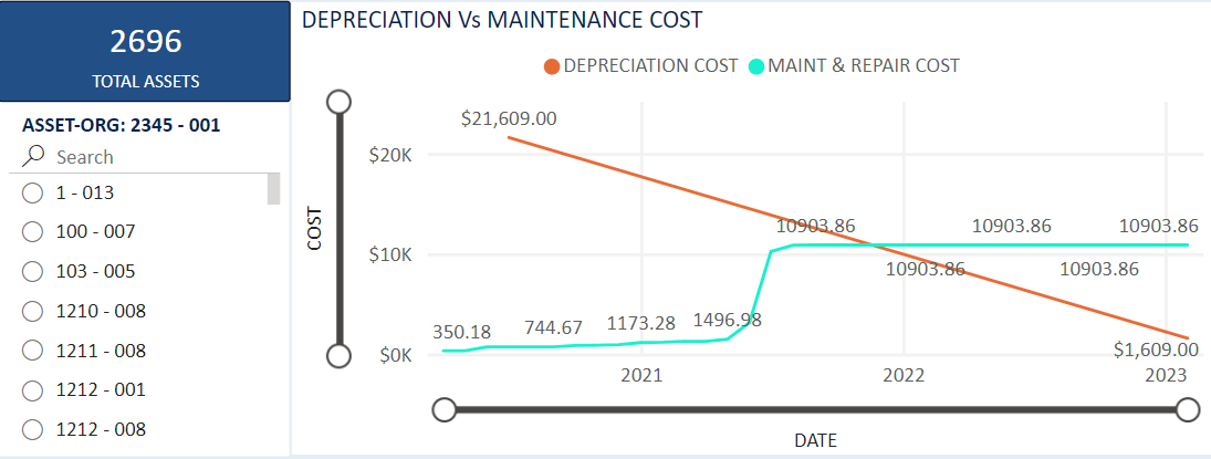
This chart derives the Maintenance Cost and Depreciation Cost of an Asset or selected Assets over Years. The objective of this chart is to identify the optimum time to replace an asset based on its current book value vs the cost of maintenance. This chart displays Assets Depreciation Cost and Maintenance cost over the time. There are two regression lines on this chart, one for Depreciation Cost and another for Maintenance Cost.
X Axis lists the InServiceDate - This is the date when Asset is in service.
Note: Any assets for which the “InServiceDate” and “AcquireDate” does not have values, those assets are ignored.
Y Axis lists the Depreciation Cost and Maintenance Cost values.
Depreciated cost = Asset.Acquire.AcquireCapitalizedCost - Asset.Replace.ReplaceCollected (It doesn't depend on time).
Maintenance Cost = Monthly maintenance cost comes from Asset.History.MaintenanceCost
The Filter used as Asset Number in a Slicer displays the chart for selected Asset Number. You can select a specific Asset Number or Search for the Asset Number from the Slicer to see its Depreciation Cost and Maintenance Cost on the chart.
Note: Data for this chart will be refreshed for every 24 hours.
Tip
To view the Depreciation Vs Maintenance Cost chart, click the Depreciation vs Maintenance Cost Chart link.
Features of the chart:
Hover over the chart to display the values of Maintenance and Depreciation cost for the selected asset.
Zoom Slider: You can zoom in and zoom out the chart using vertical and horizontal zoom slider.
Show as Table: You can see the chart values in a tabular format. From the chart More Options (...), select Show as Table option. All the fields used for the chart can be shown in the table view.
Focus Mode: You can see full page view of the chart using the Focus Mode option from the chart ellipse.
Export: You can export chart data to .csv format from the Export Data option in the chart ellipse.
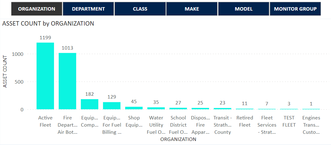
The objective of this chart is to provide different lists of Assets along with its count based on various categories like Organization, Department, Make, Model, Class, and Monitor Group. A Clustered Column chart is used to display Assets Count by different categories.
X Axis lists the Dynamic Fields that will be changed according to the category selection (Categories are Organization, Department, Make, Model, Class, and Monitor Group).
Y Axis lists the Assets Count (Distinct count of the Assets).
The Filter uses a Slicer to select a category, based on the category selection chart will display the Assets count.
Note: Data for this chart will be refreshed for every 30 minutes.
Tip
To view the Asset Count by Category chart, click the Asset Count by Category Chart link.
Features of the Chart:
Hover over the chart to display the values of Organization name and Total Asset count.
Show as Table: You can see the chart values in a tabular format. From the chart More Options (...), select Show as Table option. All the fields used for the chart can be shown in the table view.
Focus Mode: You can see full page view of the chart using the Focus Mode option from the chart ellipse.
Export: You can export chart data to .csv format from the Export Data option in the chart ellipse.
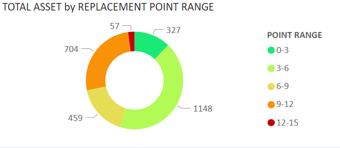
The objective of this chart is to provide Assets count that will be coming for replacement. Replacement Point scale is used by Fleet Managers to determine and plan for capital budget. A Pie chart is used to display Assets count by different Replacement Point Range.
The Legend represents the following point range:
Point Range 0-3 in dark green
3-6 in light lemon green
6-9 in yellow
9-12 in orange
12-15 in red
>15 in dark red
Values as Count of Assets (It is a distinct value).
The Filter uses a Drill Through to see details about the chart. Right click on any specific point range, to open the Drill Through option. Navigates to a new page, where the Asset Number and Point Value columns for a specific Point Range category will be displayed.
Note: Data for this chart will be refreshed for every 30 minutes.
Tip
To view the Total Asset by Replacement Point Range chart, click the Total Asset by Replacement Point Range Chart link.
Features of the Chart:
Hover over the chart to display the values of Point Range and Total Assets with percentage.
Show as Table: You can see the chart values in a tabular format. From the chart More Options (...), select Show as Table option. All the fields used for the chart can be shown in the table view.
Focus Mode: You can see full page view of the chart using the Focus Mode option from the chart ellipse.
Export: You can export chart data to .csv format from the Export Data option in the chart ellipse.
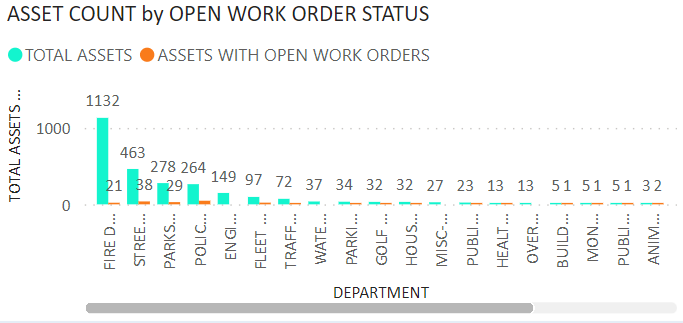
The objective of this chart is to display a list of Assets that are out of service. A Clustered column chart is used to display Open Work Order Status and All Active Assets count by different categories.
X Axis lists the Department.
Y Axis lists the Count of Assets (It is a Distinct value).
The Filter uses a Drill Through to see details about the chart. Right click on any specific point range, you will get the Drill Through option. You can select populated page to navigate. On Drill Through Page, the Asset Number, Document Number, Work Order Status Description, In Date columns will be displayed.
Note: Data for this chart will be refreshed for every 30 minutes.
Tip
To view the Asset Count by Open Work Order Status chart, click the Asset Count by Open Work Order Status Chart link.
Features of the Chart:
Hover over the chart to display the values of Department name and Total Assets.
Show as Table: You can see the chart values in a tabular format. From the chart More Options (...), select Show as Table option. All the fields used for the chart can be shown in the table view.
Focus Mode: You can see full page view of the chart using the Focus Mode option from the chart ellipse.
Export: You can export chart data to .csv format from the Export Data option in the chart ellipse.
Note: In this chart two bars for each department will be displayed. One for All active assets count, and another for Open work orders count. The Drill through functionality is only applicable for Open Work Order assets bar.
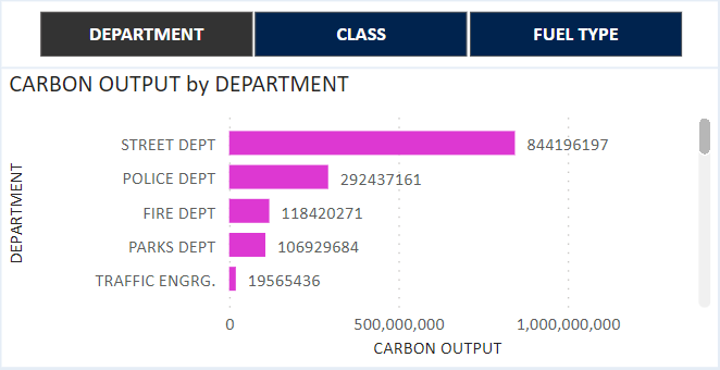
The objective of this Chart is to:
Display the reduction of Carbon Output Emissions over time.
Compare the Carbon Output Emissions for different Fuel Types (For example, Gasoline, Diesel, EV, and other types).
A Clustered bar chart is used to display Carbon Output by category.
X Axis lists Dynamic Fields that will be changed according to the category selection (Categories are Department, Class, and Fuel Type).
Y Axis lists Carbon Output (It is a calculated value). Carbon Output = faster.TLFuel.CarbonOutput * inventory.FuelTransaction.Qty.
The Filter uses a Slicer to select a category. Based on the category selection, chart will display the Carbon Output.
Note: Data for this chart will be refreshed for every 24 hours.
Tip
To view the Carbon Output by Category chart, click the Carbon Output by Category Chart link.
Features of the Chart:
Hover over the chart to display the values of Fuel Type and Carbon Output value.
Show as Table: You can see the chart values in a tabular format. From the chart More Options (...), select Show as Table option. All the fields used for the chart can be shown in the table view.
Focus Mode: You can see full page view of the chart using the Focus Mode option from the chart ellipse.
Export: You can export chart data to .csv format from the Export Data option in the chart ellipse.